A property’s Pavement Condition Index (PCI) numbers can be divided into seven levels ranging from Excellent to Failed, and then charted. We call these figures condition frequency or FREQ charts. They are plotted two different ways, bars and stacked. They present the exact same data, but a user may find one chart more helpful or explanative than another. In the presented example, the stacked chart is more helpful. The examples are from a fifth Zimmer Report update for a typical regional mall. By plotting past, current, and future pavement conditions with the amount of pavement area found within each PCI level, a clear representation of pavement conditions can be made to management.
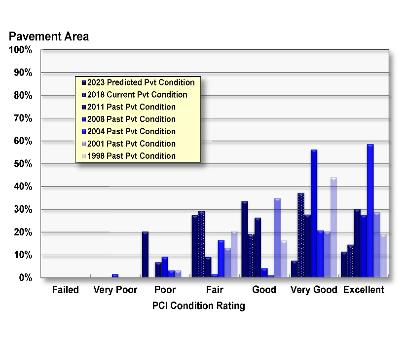
The top Figure, called FREQ Bars, is a good, quick review of conditions. The bars by year typically form a Bell curve. A curve skewed to the Excellent range signals a higher average and lower costs than a curve skewed to the poorer ranges.
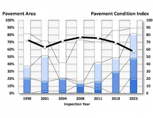
The next Figure is the FREQ Stacked. Here the condition bars are stacked and equal 100 percent of the pavement area. Lighter colors match the better conditions. The darker the color, the worse the condition. The average PCI is charted as the heavy line. Initially this property has a sharp drop in average condition, then a M&R program started after 2001 causing an increase in Excellent and Very Good pavement area with a PCI increase to about 78 (Very Good). Since 2008 there has been a gradual deterioration as the Excellent and Very Good ranges retreat to Good and Fair ranges.
As our client’s PAVER database grows, these FREQ charts can illustrate regional, portfolio, and company-wide pavement conditions.
Images from Zimmer Consultants.